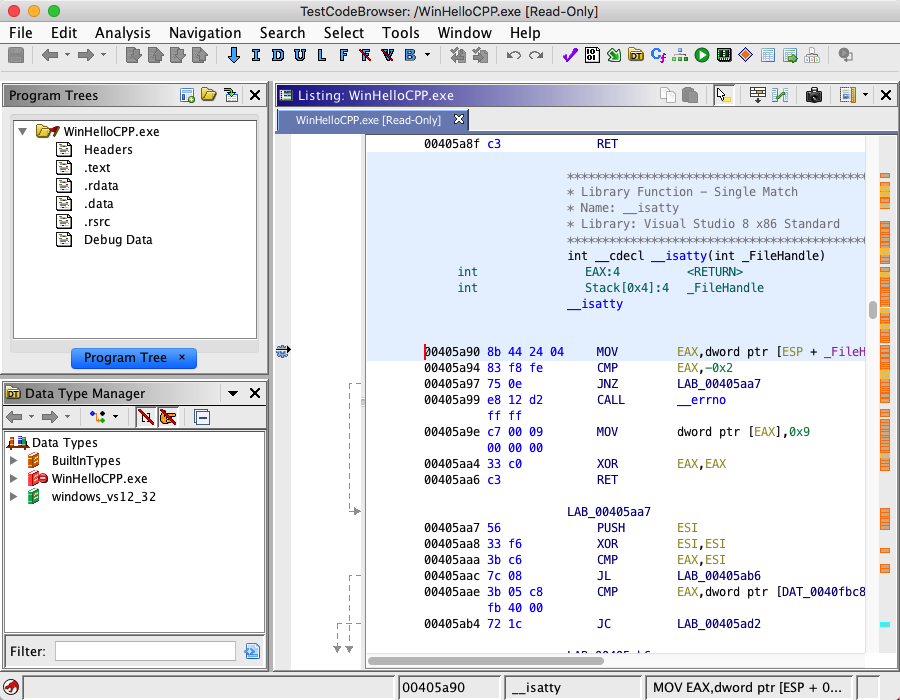
The image below shows a tool with three Dockable Components: Program Trees, Listing, and Data Type Manager.

Ghidra tools provide various GUI components that allow users to view and manage programs. The Docking Windows feature allows users to customize the layout of these "Dockable" components within a Ghidra tool.
The image below shows a tool with three Dockable Components: Program Trees, Listing, and Data Type Manager.

Each component consist of several common parts:
Title Bar
The title bar is at the top of the component and displays the title of the window. It also serves as a handle for dragging the component to other positions within the tool. The title bar's color indicates whether the component has keyboard focus. When the component has focus, the title bar is blue, otherwise it is gray. Only one component can have focus at a time.
Local Toolbar
The title bar also serves as a local toolbar. It contains icons for actions that apply only to this component. Hovering the mouse over an icon causes a tool tip to be displayed. The tool tip give a hint as to what the action will do if you select the icon.
Menu Icon
The menu icon will appear if the dockable component has a local menu. As with the local toolbar, the local menu item applies only to this component. Mouse click on the icon to show the menu.
Close Icon
Select
to hide the dockable component. The component will be removed until you select the component's name from the tool's Window menu. Some components, such as search results, are transient and are permanently removed when you close these components.
Work Area
The work area contains the specific GUI component that is being managed.
Docking Windows allows users to arrange components into configurations that best fit their needs. There are three ways components can be arranged in a tool:
- Docked with other components: components are side-by-side (or top to bottom) with another component.
- Stacked with other components: components share the same space and tabs are used to display them one at a time.
- In their own window: a component can be placed in its own window.
Moving Components
Components can be rearranged by dragging them in various ways. To drag a component, press and hold the left mouse button on the title bar of the component to be moved and begin moving the mouse. The mouse cursor will change to indicate what will happen if the mouse button is released at that location.
Invalid Location - releasing here will cancel the drag operation.
Will move the component to the left of the component that the mouse cursor is over.
Will move the component to the right of the component that the mouse cursor is over.
Will move the component above the component that the mouse cursor is over.
Will move the component below the component that the mouse cursor is over.
Will stack the component with the component that the mouse is over, creating a tabbed pane effect.
Will place the component in a new window.
To get the arrow cursors to appear, move the mouse near the inside edge of another component. To get the stack cursor, move the mouse over the middle area of another component. To get the new window cursor, move the mouse over the desktop. The Invalid location cursor will appear when the mouse is over the component being moved.
Resizing components
Docked components are separated by thin borders. When the mouse is moved over a border which separates two docked components, the cursor will change to a resize
icon. To change the relative size of the components, press the left mouse button while over a border and drag the border in the appropriate direction.
Transient components (e.g., search windows) can be renamed. Right-click on either the title bar or tab of a transient window and a popup menu item will appear that allows you to change the title of that component. This can be useful when you wish to better identify search results when you have performed many searches.
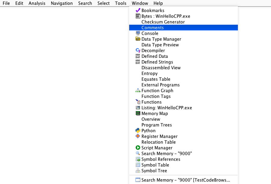
Each component currently loaded in the tool has a corresponding entry in the tool's Window menu. The menu item for a component can be used to show a component that is currently not visible. If the component is already showing, it will be brought to the front (if it is behind some other component or windows) and the component will be made active (have keyboard focus). Temporary windows such as search results are shown at the bottom of the menu below the separator bar. Multiple windows of the same type are grouped into sub-menus. For example the following snapshot of a window menu indicates there are several search results windows open.
