 |
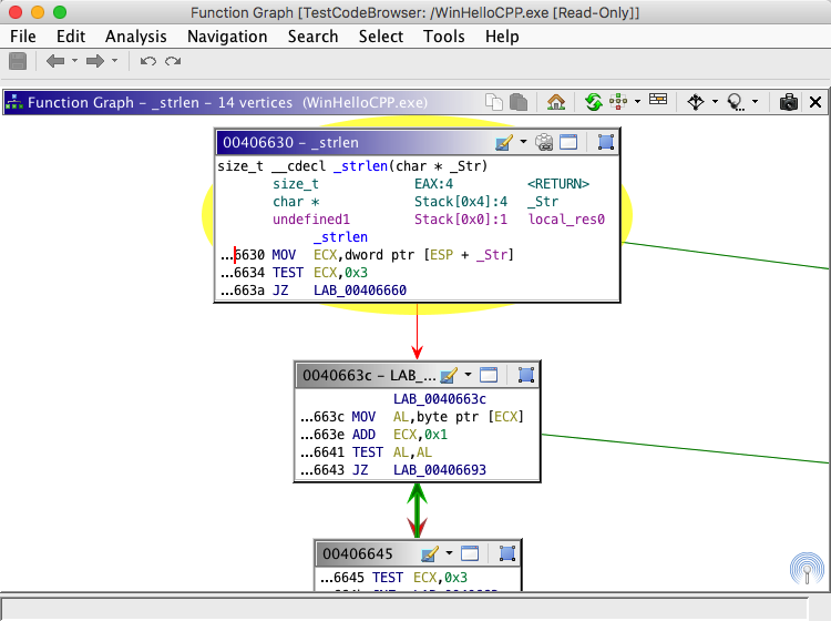
The Function Graph Plugin is a simple graph display that shows the code blocks of the function containing the cursor in the Listing.
The display consists of the Primary View and the Satellite View. There is also a group of actions that apply to the entire graph.
Ctrl-Space will toggle between the full Listing view and the Function Graph view. The
Toggle Listing and
        Function Graph
action's key binding can be changed in the tool options.
The Primary View displays the Vertices (or Blocks) and Edges (or Control Flow) of the graph. From this view you can interact with blocks, both for editing and arrangement.
The graph rendered in the Primary View may represent an undefined function, such as a subroutine. If this is the case, then the background of the Primary View will be a gray color, such in the following image:
By default, as changes to the program are detected, the graph will not relayout to account for these changes. The image below shows the bottom of the Primary View when the graph has detected changes and is considered stale
Once a graph is stale, you can press the refresh button at any time to have the graph re-create itself without performing a relayout. The green box in the image above contains the refresh button. Alternatively, you can press the relayout action to refresh the stale graph and perform a relayout, which we reposition the vertices of the graph to their preferred locations.
If you would like to change the default behavior on program changes to perform a full graph update, then you can change this value via the tool options. You can access these options by right-clicking in graph and selecting the Properties action. Alternatively, you can click on the tool's menu bar Edit->Tool Options... to launch the options. From there you can find the option at Function Graph-> Automatic Graph Relayout
The Satellite View provides an overview of the graph. From this view you may also perform basic adjustment of the overall graph location. In addition to the complete graph, the satellite view contains a lens (the white rectangle) that indicates how much of the current graph fits into the primary view.
When you single left mouse click in the satellite view the graph is centered around the corresponding point in the primary view. Alternatively, you may drag the lens of the satellite view to the desired location by performing a mouse drag operation on the lens.
You may hide the satellite view by right-clicking anywhere in the Primary View and deselecting the Display Satellite View toggle button from the popup menu.
If the Primary View is painting sluggishly, then hiding the Satellite View cause the Primary View to be more responsive.
Detached Satellite
The Satellite View is attached, or docked, to the Primary View by default. However, you can detach, or undock, the Satellite View, which will put the view into a Component Provider, which itself can be moved, resized and docked anywhere in the Tool you wish.
To undock the Satellite View, right-click in the graph and deselect the Dock Satellite View menu item.
To re-dock the Satellite View, right-click in the graph and select the Dock Satellite View menu item.
To reshow the Satellite View if it is hidden, whether docked or undocked, you can press the
button. This button is in the lower-right hand corner of the graph and is only visible if the Satellite View is hidden or undocked.
Docked Satellite Location
When the Satellite View is attached, or docked, to the Primary View, you can choose which corner to show the satellite view. To change the corner, right-click in the graph, select Docked Satellite Position and then select the appropriate sub-menu for the desired corner.
Each vertex in the displayed graph represents a code block within the graphed function. The term block is used synonymously with the term vertex. The block display consists of a header and a code listing. The fields contained in the listing are a subset of the available fields. You may change the fields displayed from the Edit Code Block Fields action.
The header contains the name of the block, as defined by the label at that location, or that address if no label exists. The header also contains buttons that allow you to perform some common operations on the block.
As long as you are within the interaction threshold, you may interact with the block's listing just as you would with Ghidra's primary Listing.
The following actions are available from the primary view.
Selecting Blocks
Left-clicking a block will select that block. To select multiple blocks, hold down the Ctrl key (or the equivalent for your OS) while clicking. To deselect a block, hold the Ctrl key while clicking the block. To clear all selected blocks, click in an empty area of the primary view. When selected, a block is adorned with a halo.
You may also select multiple blocks in one action by holding the Ctrl key while performing a drag operation. Press the Ctrl key and start the drag in an empty area of the primary view (not over a code block). This will create a bounding rectangle on the screen that will select any blocks contained therein when the action is finished.
Navigating Blocks
If you double-click a block header, then the Zoom Level of the Primary View will change. If the block is not at full zoom (1:1), then the zoom level will be changed to full zoom. Otherwise, the zoom level will be changed to fully zoomed out. If you are zoomed past the interaction threshold, then you can double-click anywhere in the block to trigger a full zoom.
Assuming you are not zoomed past the interaction threshold, then double-clicking a field inside the block's listing will perform a navigation as determined by that listing. If you are zoomed past the interaction threshold, then double-clicking anywhere in the block will trigger navigation in the same way as double-clicking the block header.
Block Information
You can hover over a block to get descriptive information. Depending upon the Zoom Level of the primary view, you will get different hovers. When zoomed past the interaction threshold, the hover action will trigger a popup window showing a preview of the block. At full zoom, you will only receive popup windows as determined by the listing inside of the block. You may disable popups as desired.
Vertex Actions
The
button allows you to set the background color for the vertex. You may press the button to choose the color currently displayed in the icon, or you may use the drop-down menu to pick a previously used color. Additionally, from the drop-down menu you can clear the color or choose a new color to set.
By default, colors applied to a vertex are also applied to the primary disassembly Listing.
The
button will group all selected vertices.
Popup Menu Vertex Actions
The
button allows you to set the label for the code block (this will also change the block header).
The
toggle button allows you to quickly view the contents of the block in a full window view, which uses the same format as Ghidra's primary Listing. To restore the graph view from the full window view, click this action again, which will then have this icon:
.
The
button will show a table of xrefs to the entry point of the currently graphed function.
This action will also appear in the vertex containing the function entry point, for convenience.
Grouped Vertex Actions
This section describes vertex grouping, which is covered later in this document.
The
button allows you to set the background color for the vertex. You may press the button to choose the color currently displayed in the icon, or you may use the drop-down menu to pick a previously used color. Additionally, from the drop-down menu you can clear the color or choose a new color to set.
Group Vertex Coloring Algorithm
This group color feature allows you to easily color large numbers of vertices after you have grouped them and to keep already set user-defined colors as you are grouping vertices.
The Function Graph will automatically color your group vertex, depending on the color state of the vertices being grouped:
- If none, or some but not all, of the vertices being grouped have a user-defined color, then the group vertex will be made the default color (which you can change from the options).
- If all of the vertices being grouped have a user-defined color, but that color is not the same, then the group vertex will be made the default color.
- If all of the vertices being grouped have the same user-defined color, then the new group vertex will be made the color of the vertices.
When a group vertex has a user-defined color, then all vertices grouped therein will take on that color.
Via the options you can disable this feature.
The
button allows you to set the text displayed in the group vertex. Unlike the action when used in a non-grouped vertex, this action will not edit the label at the start address of the vertex.
The
button will ungroup the given vertex.
The
button will group all selected vertices.
The
button will add to the given group vertex all other selected vertices.
The difference between group and add to group is somewhat subtle. The group action creates a new group vertex with each selected vertex as a child, contained inside of the new grouped vertex. Alternatively, the add to group action adds to the existing group node chosen all other selected vertices.
The regroup
button is included in the header of any uncollapsed vertex, which is a vertex that is the member of a group, where that group has been ungrouped. This action will regroup (or collapse) all vertices in the same group as the vertex containing the action. To regroup is to convert all members of a given group back into a single grouped vertex.
To remove an uncollapsed vertex from group membership, right-click on that vertex and select Ungroup Selected Vertices.
The Edges of the vertices represent a flow from one code block to another. One end of each edge has an arrowhead that represents the direction of the flow. Furthermore, the color of the edge provides a visual indication as to the type of the flow. The default flow colors are:
Fallthrough - the negative case of a conditional check Conditional - the positive case of a conditional check Unconditional - An unconditional flow The following actions are available from the primary view.
Selecting Edges
You may select an edge by left-clicking it. To select multiple edges, hold down the Ctrl (or the equivalent for your OS) while clicking. To deselect an edge, hold the Ctrl key while clicking the edge. To clear all selected edges, click in an empty area of the primary view.
Navigating Edges
Double-clicking an edge will navigate to the one of the incident blocks. The navigation will first take you to the destination block if it is not already selected. Otherwise, the navigation will take you to the source block.
Edge Information
You can hover over an edge to get descriptive information. When you hover over an edge you will be presented with a popup window showing a preview for the source and destination blocks for the hovered edge. You may disable popups as desired.
Articulated Edges
Some graph layouts create articulated edges, which are edges that contain bends in them to route around vertices. As you drag vertices around the graph the bends in the articulations in the dragged edge may disappear if the articulation causes the edge to contain awkward angles.
|
|
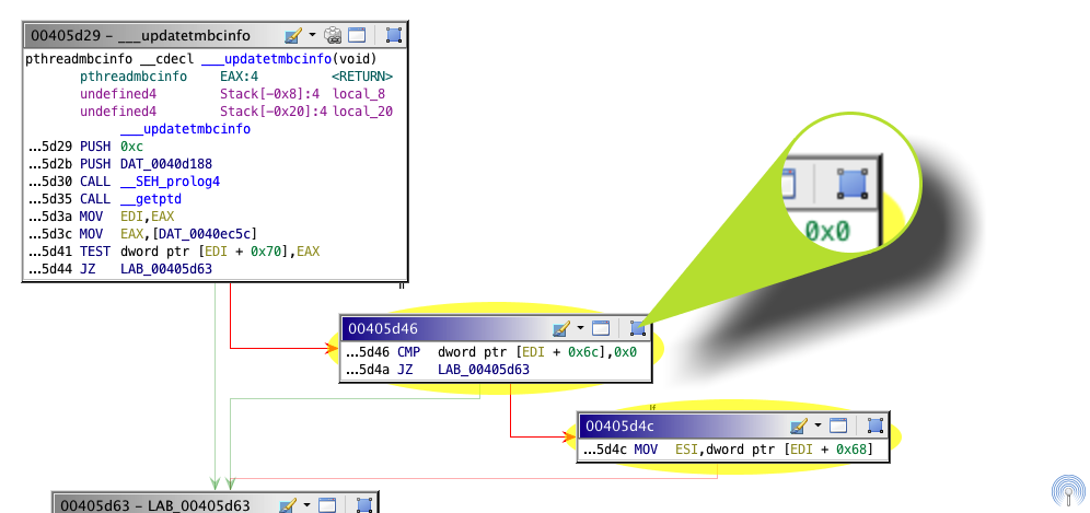
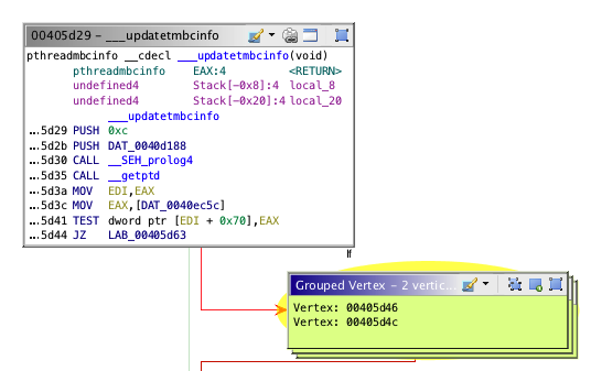
You may select 2 or more vertices to be turned into a single grouped vertex. This allows you to organize vertices to reduce the amount of information displayed in the graph. As an example, you may wish to place all branches of a switch statement into a single grouped vertex.
You can select a single vertex to group. This allows you to annotate a given vertex with text, without editing the label at the vertex address, which is the default behavior of the edit label action. In addition to setting the text for the grouped vertex, it will remove the disassembly. In this regard, grouping a single vertex is a form of information hiding.
Before a group vertex is created you are prompted to enter text that will be displayed in the body of the group vertex. By default, the titles of each grouped vertex will be listed as the text of the grouped vertex.
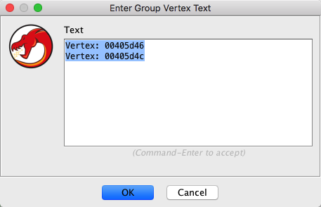
Grouped Vertex Text Input Dialog The default contents of the group vertex text entry dialog are generated from the titles of each vertex being grouped. When grouping a vertex which is itself a group, the text of that group vertex will be used in the text entry dialog in addition to its title.
Grouped vertices may contain other grouped vertices.
As you group vertices, the graph may perform a relayout of the vertices, depending upon the Function Graph Options, as described below.
The Ungrouping Process
Ungrouping a grouped vertex will restore to the graph all vertices contained in the grouped vertex. The layout behavior of the graph after performing an ungroup operation is dependent upon the graph options; specifically, the Automatic Graph Relayout option. The default setting for automatic relayout is Vertex Grouping Changes Only. This means that as you group and ungroup vertices, the graph will relayout its vertices, which may be a drastic layout change. To prevent the graph from performing a relayout during grouping or ungrouping, set the option listed above to be Block Mode Changes Only or Never.
You can access the Function Graph Options by right-clicking in an empty area of the graph and clicking the Properties menu item.
You can ungroup all group vertices in the graph via the right-click popup menu by selecting Ungroup All Vertices. Warning: this will ungroup all groups, which is an operation that cannot be undone.
Ungrouped vertices can be regrouped by executing the regroup action. This action is executed from an individual vertex, but will apply to all vertices in its group.
The following actions are buttons in the Function Graph Plugin header.
The
button will perform a copy action in one or more vertex listings. See the Clipboard help for more information on using copy in the Listing and Listing-based views.
The
button will perform a paste action in one or more vertex listings. See the Clipboard help for more information on using paste in the Listing and Listing-based views.
The
button will navigate to and select the entry point block.
The
button clear all position and grouping changes made to the graph and then perform a reload and relayout of the graph.
The
button allows you to both change the layout used to arrange the graph and to perform a relayout of the graph using the current layout. Simply pressing the button will trigger a relayout, whereas clicking on the drop-down arrow will allow you to choose a new layout.
This action allows you to perform a graph relayout without losing grouping information
The
button allows you to change the fields of the blocks' listing.
By default, the format configuration of the vertices is greatly condensed. This is done to fit as many vertices on the screen as is possible. You can make the vertices larger or smaller as you see fit. Form more information about adding and removing fields, as well as adjusting the size of the fields in the vertex listing display, see the Listing Panel's format help.
The
button will create a Snapshot of the current graph.
Path Highlight Actions
The focus and hover path highlighting modes are designed to help show the flow of execution through the code blocks in a function, as well as illustrate some of the structure. Hover highlights are triggered when you move the mouse over a block. Focus highlights are triggered by selecting a block and only work from one selected block, not with multiple selected blocks.
The focus highlight paints the edges between certain code blocks with a bold stroke, thicker than the regular edges. The hover highlight paints a dashed, thicker stroke that also moves in the direction of flow for a limited period of time.
The path highlighting modes (described in the table below) are available for both focus and hover, except in special cases, as noted.
The Automatic Graph Relayout option describes when the graph will perform an automatic relayout of the vertices as the graph changes. The available values are:
- Always - always perform a graph relayout anytime the code blocks change or when graph groups change
- Block Mode Changes Only - only performs a relayout when the code blocks of the graph change (e.g., from an external edit)
- Vertex Grouping Changes Only - only performs a relayout when the state of the graph groups changes (during a group or ungroup operation)
- Never - never perform a relayout of the graph automatically
The Navigation History option determines how the navigation history will be updated when using the Function Graph. The values are:
- Navigation Events - save a history entry when a navigation takes place (e.g., double-click or Go To event). This setting will record less history. Further, this setting works the same as the Tool's general history saving mechanism. This setting should be preferred if you wish to use the navigation actions to go back to previously visited functions more than individual addresses.
- Vertex Changes - save a history entry each time a new vertex is selected. This setting allows users to move throughout the graph view while using the navigation actions to go back to previously visited vertices. This setting will create a much larger and more detailed history list.
The Scroll Wheel Pans option signals to move the graph vertical when scrolling the mouse scroll wheel. Disabling this option restores the original function graph scroll wheel behavior of zooming when scrolled.
The Update Vertex Colors When Grouping option signals to the graph to make the color of the grouped vertex be that of the vertices being grouped.
The Use Animation option signals to the graph whether to animate mutative graph operations and navigations.
The Use Condensed Layout option signals to the graph to bring vertices as close together as possible when laying out the graph. Using this option to fit as many vertices on the screen as possible. Disable this option to make the overall layout of the graph more aesthetic.
The Use Full-size TooltipWhen toggled off, the tooltip for a vertex will be the same size and layout of the vertices in the graph. When toggled on, the tooltip for a vertex will be larger, using the layout of the Listing. The larger size is more informative, but also takes up more space.
The Use Mouse-relative Zoom option signals zoom the graph to and from the mouse location when zooming from the middle-mouse. The default for this option is off, which triggers zoom to work from the center of the graph, regardless of the mouse location.
The View Settings option describes how the graph will be zoomed when it is first loaded. The values are:
- Start Fully Zoomed Out - always start fully zoomed out so that the entire graph can be seen.
- Start Fully Zoomed In - always start fully zoomed in on the vertex containing the current location.
- Remember User Settings - keep the zoom level where the user previously left it.
There are various edge color and highlight color options available to change. The highlight colors are those to be used when the flow animations take place.
From Paths
You may create Program Selections from the current path highlights by clicking Program Selection
From Hovered Edges and From Focused Edges from the popup menu of a block. If not paths are highlighted, then these actions will be disabled.
From Code Blocks
You may select all Code Units in a Code Block by clicking Program Selection
Select All Code Units from the popup menu (or by using the default keybinding, Ctrl-A). This action will select all Code Units in all selected Code Blocks in the graph. If no Code Blocks are selected, then a Program Selection will be created for all Code Units in all Code Blocks in the graph.
Clearing Selections
You may clear the current Program Selection by clicking Program Selection
Clear Selection from the popup menu.
The primary view provides various popup windows to provide information as you hover over the blocks and edges in the graph. To enable and disable popups in the primary view, right-click anywhere in the primary view and select the Display Popup Windows toggle button from the popup menu.
The following popup menu items provide additional grouping functionality.
- Group Selected Vertices - Groups all selected vertices
- Group Selected Vertices - Add to Group - Adds the selected vertices to group vertex in the selection. This action will not be enabled if there is not one, and only one, group vertex in the selection.
- Remove From Group - Removes the uncollapsed vertex from its group.
- Ungroup All Vertices - Ungroups all vertices in the graph, not just those selected or visible. This operation cannot be undone!
- Ungroup Selected Vertices - Ungroups the selected group vertices
There are various ways to move the graph. To move the graph in any direction you can drag from the whitespace of the graph.
By default, to move the graph vertically you can use the mouse wheel. In previous releases the scroll wheel was used to zoom. Now there is an option to restore that behavior, the Scroll Wheel Pans option. When this option is on, you can zoom by holding the Control key (Command key on the Mac) while using the scroll wheel. Alternatively, you can move the graph left to right using the mouse while holding Control-Alt.
The satellite viewer may also be used to move the primary graphs view by dragging and clicking inside of the satellite viewer.
At full zoom, or block level zoom, each block is rendered at its natural size, which is the same scale as Ghidra's primary Listing. From that point, which is a 1:1 zoom level, you can zoom out in order to fit more of the graph into the display.
To change the zoom you may use the mouse scroll wheel while holding the Control key (Command key on the Mac). This works whether the mouse is over the primary viewer or the satellite viewer. Also, you may use the context popup menu from the primary viewer in order to quickly zoom to the block level (1:1) or to the window level (zoomed out far enough to fit the entire graph in the window). These actions are Zoom to Vertex and Zoom to Window, respectively.
To have the scroll wheel zoom without holding the Control key, you can disable the Scroll Wheel Pans option.
To zoom the graph incrementally using the keyboard you can use the Zoom In and Zoom Out actions. These actions have default keybindings of Control-Minus and Control-Equals.
The satellite viewer is always zoomed out far enough to fit the entire graph into its window.
If you double-click a block header, then the Zoom Level of the Primary View will change. If the block is not at full zoom (1:1), then the zoom level will be changed to full zoom. Otherwise, the zoom level will be changed to fully zoomed out. If you are zoomed past the interaction threshold, then you can double-click anywhere in the block to trigger a full zoom.
While zooming out (away from the blocks) you will eventually reach a point where you can no longer interact with the listing inside of the block. The blocks provide a subtle visual indication when they are zoomed past this level, in the form of a drop-shadow. The image below shows this drop-shadow. The block on the left is not past the interaction threshold, but the block on the right is, and thus has a drop-shadow. This example is for illustrative purposes only and during normal usage all blocks will share the save zoom level. So, if one block is zoomed past the interaction threshold, all other blocks will be as well.
Interaction with blocks that are past the interaction threshold is simplified; for example, when scaled past the interaction threshold, dragging in the listing area of a block will drag the block, instead of making a selection in the listing, as would happen when not scaled past the interaction threshold.
While zooming out (away from the blocks) you will eventually reach a point where contents each block will not be painted. Instead, each block will be painted by a rectangle that is painted with the current background color of the block.
Zooming past the painting threshold will improve the rendering speed of the Primary View.
The Function Graph Plugin will automatically save your changes to the graph, specifically, coloring nodes, grouping nodes, zooming and panning. This happens as your change the function displayed in the graph and when you close the graph window.
Changes made to Snapshots will not be saved. This is done to avoid conflict between changes made to the connected view and any of the snapshots
Provided by: Function Graph Plugin