The Listing View is the main windows for displaying and working with a program's instruction and data.
Listing View
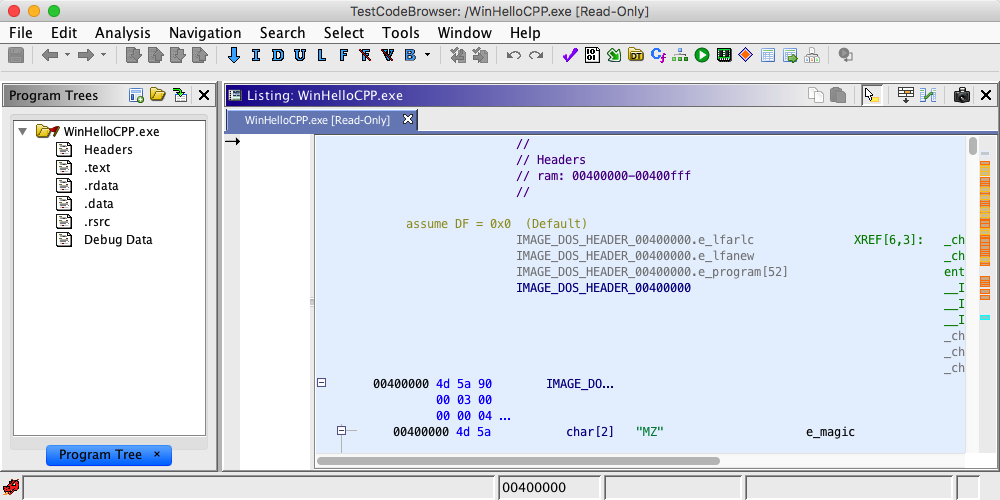
In the Code Browser tool displayed above, the Listing is shown to the right of the Program Tree. The Listing is currently showing a snippet of code for "WinHelloCPP.exe". Code is made up of various elements such as addresses, bytes, mnemonics, and operands. The Listing uses fields to display these elements. The overall layout of the Listing can be changed by adjusting the size and position of the fields using the Browser Field Formatter.
The Listing can either display an entire program or a subset of a program. The view determines the set of addresses that are displayable in the Listing. By default, the view contains the entire program, but other Ghidra components can restrict the view to some subset of the program. For example, the Program Tree can be used to restrict the view to a module or fragment. If the view is larger than the screen size, a vertical scroll bar will appear that allows the display to be scrolled anywhere within the view.
The Listing maintains a cursor location. Even though the Listing never actually changes a program, it plays an important role for plugins that do. Many Ghidra plugins operate at a specific address or even on a specific field on an instruction at an address. These plugins use the Listing's cursor position to determine the appropriate "program location".
The cursor can be moved by using any of the "arrow" keys or by clicking the mouse over any appropriate location.
The Listing also maintains a selection (shown using a green shaded area). Some plugins operate on a particular address. Other plugins can operate over a range of addresses. For these plugins, the selection is used to determine the range of address on which to operate.
A selection can be set by either dragging the mouse while holding down the left mouse button or by pressing the <shift> key while moving the cursor with the "arrow" keys.
Pressing the <Ctrl> key down while clicking the mouse will either add to the selection if that line is not already in the selection or it will remove that line from the selection.
Clicking the mouse anywhere (without dragging) will cause the selection to go away.
Since the selection is transient (it goes away easily), the Listing also has the concept of a highlight. The highlight is similar to the selection, but it stays around until it is explicitly cleared. To create a highlight, first create a selection and then use the Highlight menu to convert the selection to a highlight. Later the highlight can be converted back into a selection using the same menu. At that point an action can be applied to the selection.
Highlights are not saved across program sessions. To achieve a lasting color effect, you can color the Listing background.
See Listing Background Colors
The Listing provides built-in navigation functionality for addresses and labels. Double-click on any address, label or reference markup within the Listing and it will attempt to reposition to that location if it exists in the program. If the address exists in the program but not in the current view, the view is expanded to include the address. If the location refers to an external location and it is associated with another program, that program may be opened and positioned within the CodeBrowser. See the tool Edit Tool Options dialog for control over certain Navigation behaviors.
In the XRef field, sometimes there are too many addresses to display so the the field will display "[more]" to indicate that one or more cross-reference addresses are not shown.
Double-clicking on the "XREF[n]: or [more]" text will cause a dialog containing all the Xrefs to appear.
This differs from the Show References to ... feature in that the Xrefs dialog is simply a display of what already exists in the database, whereas Show References to ... will perform a search to find references additional to what is in the database.
This dialog lists all the Xref addresses, any labels that are at that address and a preview of the instruction at that address. Clicking on any row in the table will cause the browser to navigate to that address
Show Thunk Xrefs
Available when viewing all Xrefs to a particular function, this toolbar action allows you to see not only xrefs directly to the function, but also any xrefs to functions that thunk that function as well. With this action toggled on you will see all Xrefs to the final 'base' thunked function, along with all Xrefs to functions that thunk that function, regardless of which function was used to launch the dialog. Alternatively, when toggled off, you will only see those Xrefs that point to the function used to launch the dialog.
The following key mappings are used by the Listing:
Markers are used to indicate special locations within a program. These location can either be specified by the user (Bookmarks) or by various Ghidra plugins (Search, Analysis, Changes, etc). There are two types of markers: Margin Markers and Navigation Markers.
Markers
Margin Marker
Margin Markers appear on the left side of the Listing and are used to indicate locations within the currently displayed code. There are two types of Margin Markers - Point Markers and Area Markers. Point Markers are used to indicate individual addresses (Ex: bookmarks, search results, breakpoints, etc) and are displayed using icons. Area Markers are used to indicate a range of addresses (Ex: areas in the program that have been changed) and are displayed using a colored vertical line.
Navigation Marker
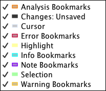
Navigation Markers appear on the right side of the listing and are used to indicate locations within the overall view. These markers provide an overview of all the markers and an easy way to navigate to them. Navigation Markers are displayed as colored bars where each color represents a different type of marker. To see the color assignments bring up the Marker Popup Menu as described below.
To navigate the browser to the actual location of a marker, left-click on the marker. The browser will be repositioned to display the location represented by that marker.
The Navigation Marker area is divided into two vertical areas. The left area is used to display Point Markers while the right area displays Area Markers. This prevents the Point markers from being hidden by the Area markers.
You can control what is displayed in the Navigation Marker area by right-mouse clicking in the margin; a popup menu is displayed, as shown in the image below. Turn markers on and off by clicking on the appropriate menu item.
Marker Popup Menu
The markers shown in the Marker Popup Menu are described below:
Analysis Bookmarks Bookmarks inserted by the auto analysis process. Indicates information about where functions and address tables were created. Changes: Conflicting Areas where you and others have made conflicting changes. Changes: Latest Version Areas where changes exist in the latest version made by another user. Changes: Not Checked-In Areas where you have made changes since your last check-out. Changes: Unsaved Areas where you have made changes to the Program. Error Bookmarks Areas where the disassembler created Error bookmarks due to encountering bad instructions. Highlight Areas that are highlighted (non-transient selections). Info Bookmarks Bookmarks inserts by a plugin to indicate a location of interest. Note Bookmarks Bookmarks inserted by the user. Register Values
Areas where the selected register has defined values. Appears only when the Register Manager Window is visible.
Selection Areas that are selected (transient).
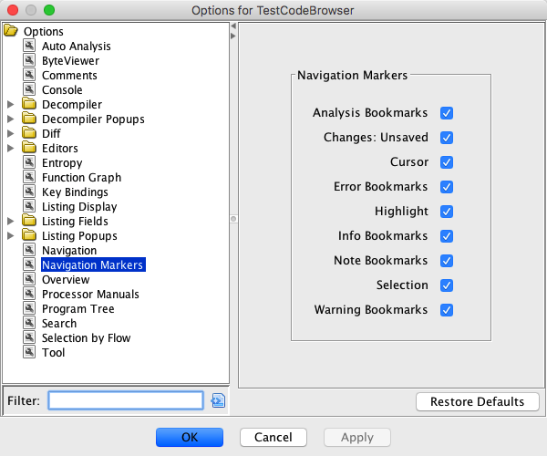
Another way to control the display of Navigation Markers is to set the options in Navigation Markers panel of the Edit Options dialog, as shown below. Select the Navigation Markers node in the Options tree. Click the appropriate checkbox to turn the marker on or off.
Navigation Marker Options
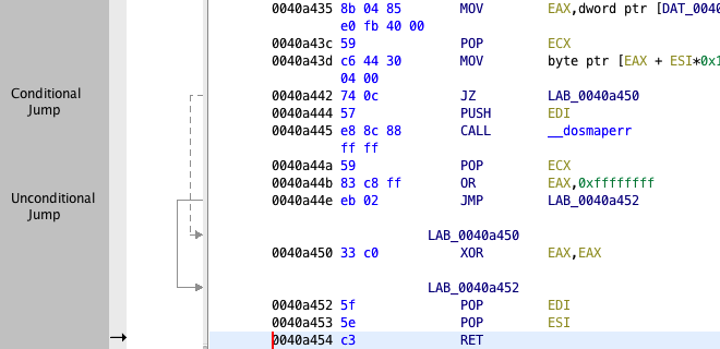
The flow arrows graphically illustrate the flow of execution within a function. They appear as arrows on the left side of the Listing display indicating source and destinations for jumps. Conditional jumps are indicated by dashed lines; unconditional jumps are indicated by solid lines. Flow lines are bolded when the cursor is positioned at the source of the jump.
Flow Arrows
Selecting Flow Arrows
By default, flow arrows are only shown when either the start or end address is visible. Thus, as you scroll the Listing, you will see flow arrows appear and disappear, as the addresses the arrows are based upon appear and disappear in the listing.
Disabling Flow Arrows
The panel displaying the flow arrows can be resized by dragging the border between it and the main code browser panel. To hide the flow arrows, simply drag the border until it is no longer visible. The arrows automatically disable themselves when they are no longer visible.
Navigating Flow Arrows
You can double-click a flow arrow to navigate to its end point. Also, if the cursor is at the end point address, then you can double-click to navigate to the start point of the arrow. Each double-click will go to the opposite end of the arrow, whenever the Listing cursor is at an endpoint.
The Listing includes the capability of displaying popup windows when the user hovers the mouse over a particular field. This occurs whenever a plugin has additional information that it wants to display about that field. The popup window disappears when the user moves the mouse off of the window or field. Some example popup windows that can be displayed: Reference Popups, Truncated Text Popups, and Data Type Popups.
Reference Popups
Reference popups are displayed whenever the mouse is hovered over a memory reference. A Reference popup containing a Listing window is displayed showing the code referred to by the reference. The Listing popup uses the exact same formatting and layout as the primary Listing except for the background color, which is displayed in a unique color to distinguish the popup. You can click and scroll within the Listing popup, however, you cannot follow references within the reference popup. The reference popup can be quite useful for quickly inspecting a series of calls without having to navigate within the Listing or to quickly examine data located in another part of the program's memory. The figure below shows an example of a reference popup.
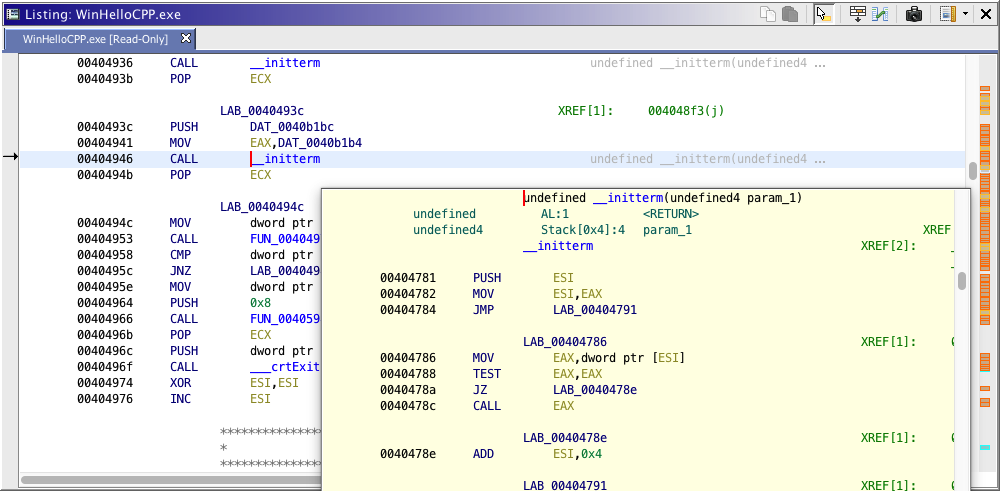
Reference Popup
You can change the size of the popup can be changed by editing options. Choose Edit
Tool Options..., click on the Listing Popups node in the Options tree. Select the Reference Code Viewer node to display the height and width values of the popup. Edit the values and click on the OK or Apply button.
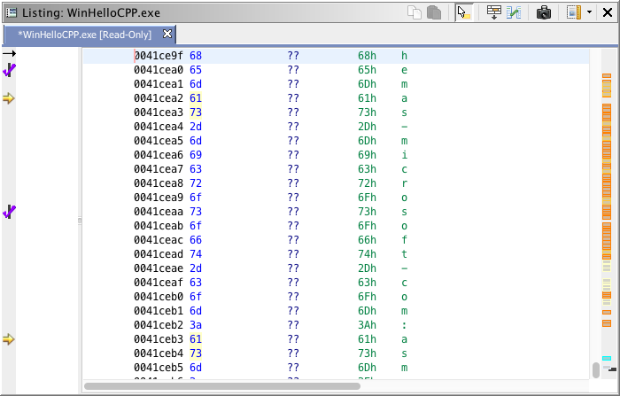
Truncated Text Popups
Truncated text popups are displayed whenever the mouse is hovered over a field where the size of the text exceeds the field size and is therefore truncated. A tooltip-like window is displayed showing the entire contents of the truncated field (provided the contents fits on the screen). This is particularly useful for long strings and data within a program that cannot be fully displayed. The figure below shows an example of a truncated text popup.
Data Type Popups
The data type popup is shown whenever the user hovers over a the mnemonic field where a data type has been set. The figure below shows an example of a data type popup.
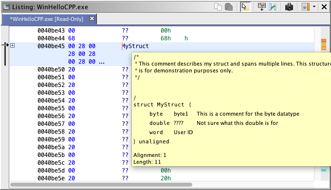
Data Type Popup
Address Popup
The address popup is shown whenever the user hovers over an address. It shows the relationship between the hovered address and the base of memory and the containing memory block. For addresses in functions, the function offset is also shown; for addresses within a complex data (structure, array, etc.), the offset from the base of that data is shown. Also, if the byte value for the address can be traced back to the original imported file, then the filename and offset for that location is displayed
Function Name Popup
Displays the hovered symbol's parent namespace for symbols that are inside of functions.
Scalar Popup
Displays the hovered scalars as 1-, 2-, 4-, and 8-byte values, each in decimal, hexadecimal, and as ASCII character sequences.
Disabling Mouse Hover
Because the mouse hover popup windows can sometimes get in the way, a mechanism for quickly disabling them is included. Simply click the icon illustrated above to toggle mouse hover mode. This icon appears in the top right corner of the Listing's toolbar whenever a mouse hover plugin is loaded. When clicked, the icon will change to indicate the new state.
Mouse Hover Enabled
Mouse Hover Disabled
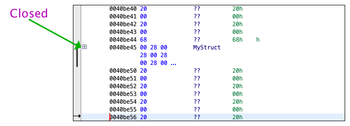
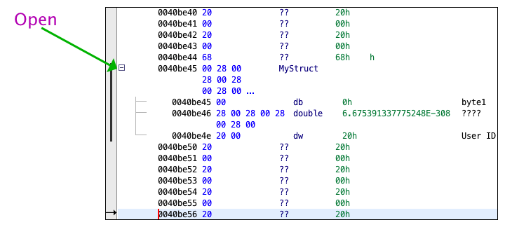
Structures and arrays consist of smaller component data types. By default, the contents of structures and arrays are not displayed. There is a Open/Close control (+/-) that can be used to display or hide the contents of structures and arrays.
To see the contents of a Structure or Array, select on the + icon.
To hide the contents of a Structure or Array, select on the - icon.
Structures within Structures, Unions and Arrays can be opened in the same manner.
Actions for Expanding/Collapsing Data
You may also expand and collapse data structures from the right-click popup menu via the Expand All Data, Collapse All Data, Expand All Data In Selection, Collapse All Data in Selection, and Toggle Expand/Collapse Data actions respectively. These actions are only available when the popup menu is activated under certain conditions. The actions are described in detail below:
- Expand All Data - This action will expand a data element and all its children recursively starting with the data at the cursor location. This action will only appear when the cursor is on a data that is expandable.
- Collapse All Data - This action will recursively collapse the outer most expandable data element containing the data at the cursor location. This action will only appear when the cursor is on an expandable data element or any of its child elements at any level.
- Expand All Data In Selection - This action will search the current selection and find all expandable data elements and then recursively expand each such data element and all its children. This action is available whenever there is a selection.
- Collapse All Data In Selection - This action will search the current selection and find all expandable data elements and then recursively collapse each such data element and all its children. This action is available whenever there is a selection.
- Toggle Expand/Collapse Data - This action will toggle the expanded/collapsed state of an expandable data element. If it is expanded, it will collapse it and if it is collapsed, it will expand it. Additionally, if the cursor is on a non-expandable data element that is contained in a parent expandable data element, then the parent element will be collapsed. This action is available whenever the cursor is on an expandable data element at anly level or when the cursor is on a data element inside another data element.
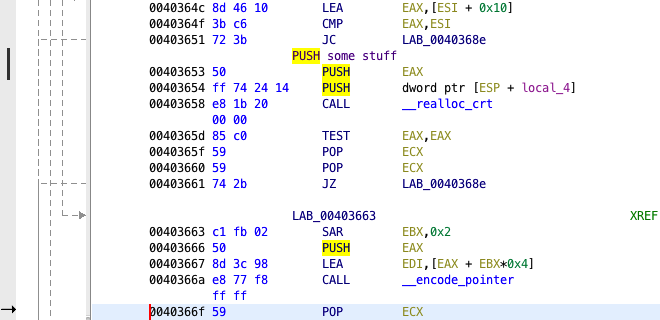
The Listing is comprised of many fields which are used to display the individual elements of a program (address, bytes, operand, etc). Clicking the middle mouse button on a field places the cursor in that field and causes the text under the cursor to become highlighted along with all other occurrences of that text. For example, in the figure below, the cursor is on the "PUSH" mnemonic at address 0x01004072. Notice that every "PUSH" on the screen (not just the mnemonics) is also highlighted. Specifically, the "PUSH" in the comment is highlighted. The Cursor Text Highlight makes no distinction as to what type of information is being highlighted. To determine matches that should be highlighted, a case-sensitive whole-word string compare is used.
Cursor Text Highlight
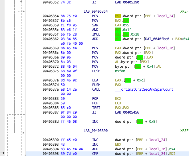
This feature has additional functionality when used on registers. In this case, the highlight can be restricted to show the "Scope" of a register. The "Scope" of a register starts where the register is assigned a value and ends at the last use of the register before it is written with another value (when a register is both read and written, then it will be shown as a read).
When the middle mouse is clicked on a register, the scope of the register is computed. The register is highlighted from the point it is initially assigned a value (written) to the point it is last uses that value. With "Scoping", three different colors are used. The read highlight color is used at locations where the register value is read (light green in the image below). A slightly darker color is used at the location where the register is written (dark yellow in the image below). All other matching registers outside of the current scope will be highlighted with the default highlight color (yellow in the image below).
This feature can be turned off by adjusting highlight settings (see below).
Scoped Register Highlight
Default Settings
By default, the cursor text highlight is:
- Enabled
- Painted in yellow
- Only activated by using the middle mouse button
- Scoping turned on
Configuring
Use the Tool Options dialog to turn off the Cursor Text Highlighting, as well as to configure the color and activating mouse button.
There are many options for changing the appearance of the Listing. To change the arrangement of fields, use the Code Browser Formatter. All other options are tool options. See Tool Options for a complete description of the options and how to change them.
If an error ever occurs while the code browser is attempting to display information in a field, it will show an "*Error*" field instead. Double-click on the error field to display the Log Details dialog.
Provided by: Code Browser Plugin